The Princess

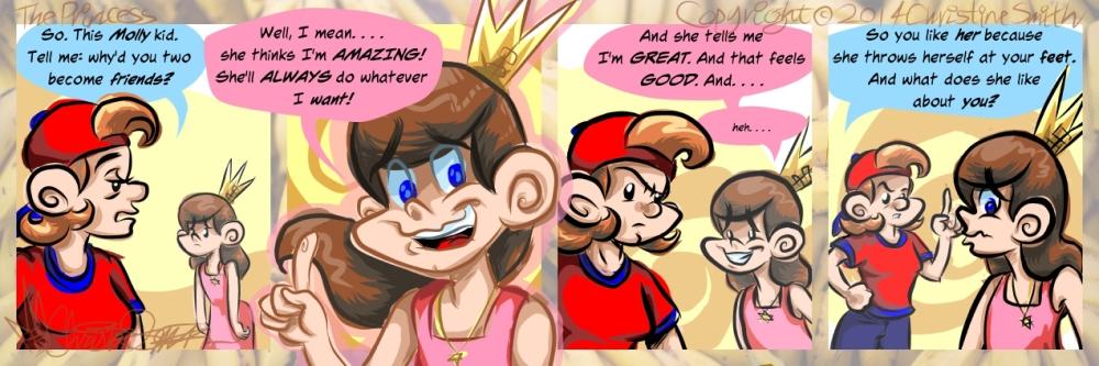
To My Beloved Royalty...

The conversation starts!
Until I can get a permalink, here's my Patreon info: http://www.patreon.com/theprincess

THANK YOU SO MUCH to all my lovely patrons!!!!!!

Also.... I don't think I'm gonna do the 'colored line' thing again. Yeep.

Speak Out


Subscribe to our feed

Comments:


stephy1aq
*Guest*
 

 Quote  Reply     

Guest post by "stephy1aq"
"also... I don't think I'm gonna do the "colored line" thing again. yeep"      ???! don't get what you mean, please explain.

Submitted May 23, 2014 at 2:38AM


Rachel P
*Guest*
 

 Quote  Reply     

Guest post by "Rachel P"
It refers to the second panel, where the outlines are mostly in colours, rather than the usual black. Rather nice effect though.

Submitted May 23, 2014 at 2:54AM


Rainey
*Guest*
 

 Quote  Reply     

Guest post by "Rainey"
I kinda like it; maybe not for the whole comic, but a once in a while thing to express a certain emotion in the panel that might otherwise seem a little vague.
And yes! The conversation is here! I can't wait to see what comes of this.

Submitted May 23, 2014 at 8:26AM


Bonnie
*Guest*
 

 Quote  Reply     

Guest post by "Bonnie"
I like the emphasis it brings to that panel as well. But it's up to the artist :-)

Submitted May 23, 2014 at 11:21AM


Z
*Guest*
 

 Quote  Reply     

Guest post by "Z"
I agree that it doesn't really work in the second panel. I don't know if it's the panel, or what. It can be quite pretty and add depth. Maybe if the lines were darker it would work better. I also find that it gives a softer look to the piece, which doesn't really mesh with Sarah's freaked out expression. It would add to the more upbeat and light-hearted strips, but here it contrasts with the tone of the strip.

I think that the different line colors work in the other panels, though. It works really well for the first and third panels because it adds to how deflated Sarah works, in the final panel- it might be better to have it a little darker because Lucy is still an imposing figure and it seems a little conflicting to have her greyed out like that given her pose. Obviously this is a lot more work and it'll take time to work out how to do it properly, so if you don't have the time for it, I'm sure everyone understands. It looks fine with all black lines.

A+ to Lucy for getting straight to the root of the problem. And good that Sarah realizes that this isn't a good situation, even if she doesn't want to admit it to herself. This friendship isn't totally doomed, but things really need to change. I don't think either girl sees the other as a full person to be friends with.

Submitted May 23, 2014 at 8:30AM


RachelN
 

 Quote  Reply     

I always thought it was kind of suspicious that Sarah became "friends" with Molly immediately after the falling out with Irma. Sarah thought Irma was mocking who she was, while Molly practically worships at Sarah's feet. At first I thought she might have befriended Molly to spite Irma, but it was probably more to fill the void that Irma left (a void Sarah has yet to admit to).


Last edited by RachelN
Edited 1 time(s).

Submitted May 23, 2014 at 5:27PM


Z
*Guest*
 

 Quote  Reply     

Guest post by "Z"
Sarah met Molly before she and Irma fell out, which is probably part of how Sarah is justifying this to herself ("Molly and I were friends before, we're just spending more time together now..."), and I agree that the fact that she suddenly became so 'close' to Molly almost immediately after falling out with Irma is VERY telling. I'm sure Lucy's going to point that out as well.

Submitted May 23, 2014 at 6:18PM


RachelN
 

 Quote  Reply     

Regarding the "colored line" effect, I agree with what Bonnie said. It emphasizes that panel, and also illustrates Sarah's uncertain emotions quite well.


Last edited by RachelN
Edited 1 time(s).

Submitted May 23, 2014 at 5:43PM


Being Useful
*Guest*
 

 Quote  Reply     

Guest post by "Being Useful"
I think the colored lines thing can work fine(look at Disney!)

The main problem here is that the panel looks like a newspaper misprint--the colored lines and the fill colors don't match up. It makes it look very surreal.

I wouldn't abandon it completely, but I would consider doing some practice runs with it to get it how you want.

For the purposes of this segment, it works well--she looks about as insubstantial as she seems to feel running face-first into that pointed question.

Submitted May 24, 2014 at 4:56AM


Pinkbatmax
 

 Quote  Reply     

No, that's not a problem. No practice is necessary to 'stay within the lines'. I always draw outside the lines. I have many reasons for it, but it's an aesthetic choice, and one I'll continue with. It's not accidental, it's not sloppiness. Quite the contrary in fact. Clicking the paint can tool is easy. It takes work to draw outside, and it's a joy for me to put in that effort. It's about gesture and life and movement, it's about aesthetics and theme, and it also functions metaphorically. It's a choice, it works, and it will continue. It's the price of entry to enjoying my work, or not enjoying it. Either is fine, but that quality is not going to change soon. Non negotiable, take it or leave it.


Last edited by Pinkbatmax
Edited 6 time(s).


Submitted May 24, 2014 at 6:43PM


Pinkbatmax
 

 Quote  Reply     

As for what I meant.... well, it was late at night. I think it clashes, and doesn't communicate exactly what I want here. I've been using the style in other work to good effect, so I think I need to figure that out.


Submitted May 24, 2014 at 6:49PM


Being Useful
*Guest*
 

 Quote  Reply     

Guest post by "Being Useful"
Not sure why you took that as an insult.

I don't think you quite got what I meant by "practice runs". Wasn't saying "you're incompetent", was saying "I think it could work, but you probably will need to try doing it several different ways before you find the magic formula"

Submitted May 25, 2014 at 3:42AM


Pinkbatmax
 

 Quote  Reply     

I disagree very strongly. This where my passion comes from. When you tell me what the "main problem" is.... and you did exactly that.... I'm going to defend my work passionately.


You're entitled to your opinion. However, what you describe as the main problem is a defining feature of my work. It makes my work distinctive. I am a member of several artistic communities full of educated and accomplished artists whom I respect. Most if not all praise my work for the very quality you describe as a problem. Not everyone agrees, but it's a consensus opinion.

And while you're entitled to your opinion, I'm entitled to mine, and I will express it.

Unfortunately, I'm no Buddha, I'm no Saint. Sometimes I get a bee in my bonnet, and my response reflects that. Part of being human, I suppose. I'm going to continue to express my opinion, forcefully where I feel strongly. In this case, I recognize you're trying to be helpful, but you're wrong. You can accept my explanation or not. You can disagree or not. But when you tell me what's wrong with my work, expect a response.


Last edited by Pinkbatmax
Edited 2 time(s).


Submitted May 25, 2014 at 2:24PM


Being Useful
*Guest*
 

 Quote  Reply     

Guest post by "Being Useful"
Uh, okay. But if it was flawless(without any problems), you'd be doing it again with great joy.

Submitted May 26, 2014 at 7:48PM


Quick Reply

Name *Get an Avatar*
Email *Will not be displayed.
Website *Optional - May cause your post to be moderated.

Check the hummingbird.
Please check the proper button (from the phrase above) before submitting.

Image

Image

Image

Image

Image

Image